PROOVEN (UI Design)
Investing in Properties?
Prooven propels you forward
Prooven is a responsive web app that provides property buyers with information on properties of interest.
Context: Real estate investment is an increasingly popular way for individuals to achieve financial security. Buyers new to the market may struggle to get started without professional guidance and waste time viewing properties out of their range. This web app will provide them with the expertise needed to get started efficiently.
Role: UI Designer
Skills: Visual Design, Interaction Design, Wireframing, Prototyping
Tools: Figma, Balsamiq, Photoshop
Time Frame: 2 months
Understanding
For this project, the UX research was provided, including the user stories, objectives and persona. This helped me envision the people I was designing for, their needs, and how they navigate a web app to reach their objective. From this information, I created a user flow.
User Stories:
As a user, I want to be able to search and filter properties, so that I can find good matches based on my needs.
As a user, I want to be able to contact the right people if I am interested in viewing a property, so that I schedule a viewing.
As a user, I want to be able to save or mark properties I am interested in, so that I can easily revisit them.
User Persona Summary:
Rashida, an IT consultant who makes a good living, is new to real estate investing, and needs a tool to locate the right properties quickly.
Low Fidelity Wireframes
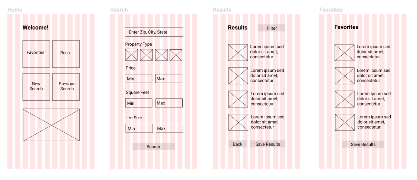
After developing the user flow, I created low fidelity wireframes using Balsamiq to quickly imagine where elements would appear on a screen and how a person would navigate from screen to screen.
I then transferred the screens onto Figma, where I used grids and visual hierarchy to aid with the placement of elements.
Mood Board and Color Palette
To define the creative direction and feel of the app, I put together two potential mood boards, which got me thinking about the colors I might use for my palette.
After deciding to move forward with the second mood board, I developed it further and finalized a color palette to match.
Other Style Elements
To further establish the creative direction of the app, I composed a style guide including the typography, iconography and other UI elements such as animation.
Typography
Iconography
Other UI Elements
Animation
Responsive Design
Because Prooven is a web responsive app, the app would need to be aesthetically pleasing and usable on various devices. With that in mind, I showed how certain elements might look and function differently in multiple breakpoints such as a tablet and a desktop.
Final Design Mockups
Mockups from Pixeden.com


